Building a Better Billboard Website · Article 3 of 8
Advertisers rarely arrive at a billboard website thinking like an inventory manager.
They need better billboard website navigation because they are not usually looking for a face ID, a unit number, or the internal name your team uses for a structure. They are thinking about a city. A highway. A retail corridor. A school district. A hospital. A route between two markets. A place where their customers already drive.
That difference matters.
Navigation is part of the sales process.
A billboard website does more than organize information. It guides the advertiser from a broad need toward a specific location that may fit the campaign. When that path is clear, the website helps the visitor think. When it is unclear, the visitor has to work too hard before the sales conversation even begins.
The advertiser is trying to narrow the world
A billboard operator may look at inventory and see an organized internal system. Static faces, digital faces, markets, availability, pricing, contract status, photos, and IDs all have a place inside the business.
An advertiser usually starts with a less technical question.
“Do you have anything in this area?”
That area may not match how the operator organizes inventory internally. It may be a city name, a county, a stretch of highway, a shopping district, a commuter route, or a destination people recognize locally. The advertiser may not know which market name your company uses. They may not know whether a board is technically inside one city limit or just outside it. They may not care.
They’re trying to understand a place.
This is where many billboard websites make the visitor hunt. The inventory may technically be on the website, but it is buried behind a generic “Locations” page, a PDF, a map with too many pins, or a long list that only makes sense to someone who already knows the company’s system.
That is not only a navigation problem. It is a sales problem.
When a visitor cannot quickly understand where the inventory is, they have to decide whether to keep searching, call with a vague question, or leave. Some will still contact the company. Others will not. Either way, the website has added friction to a conversation that should have been getting clearer.
Good navigation follows the buyer’s mental map
The strongest billboard websites are organized around how advertisers naturally look for outdoor advertising.
Some visitors begin with a market. They want to know whether the company covers a region well enough for a campaign.
Some begin with a city. They need boards near where their business operates or where they want to grow.
Some begin with a highway. They care about commuter traffic, interstate visibility, tourism routes, or the road between two towns.
Some begin visually. They want a map, photos, and nearby landmarks before they understand which locations matter.
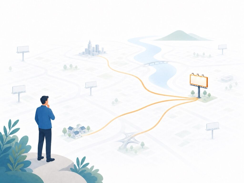
None of those paths is wrong.
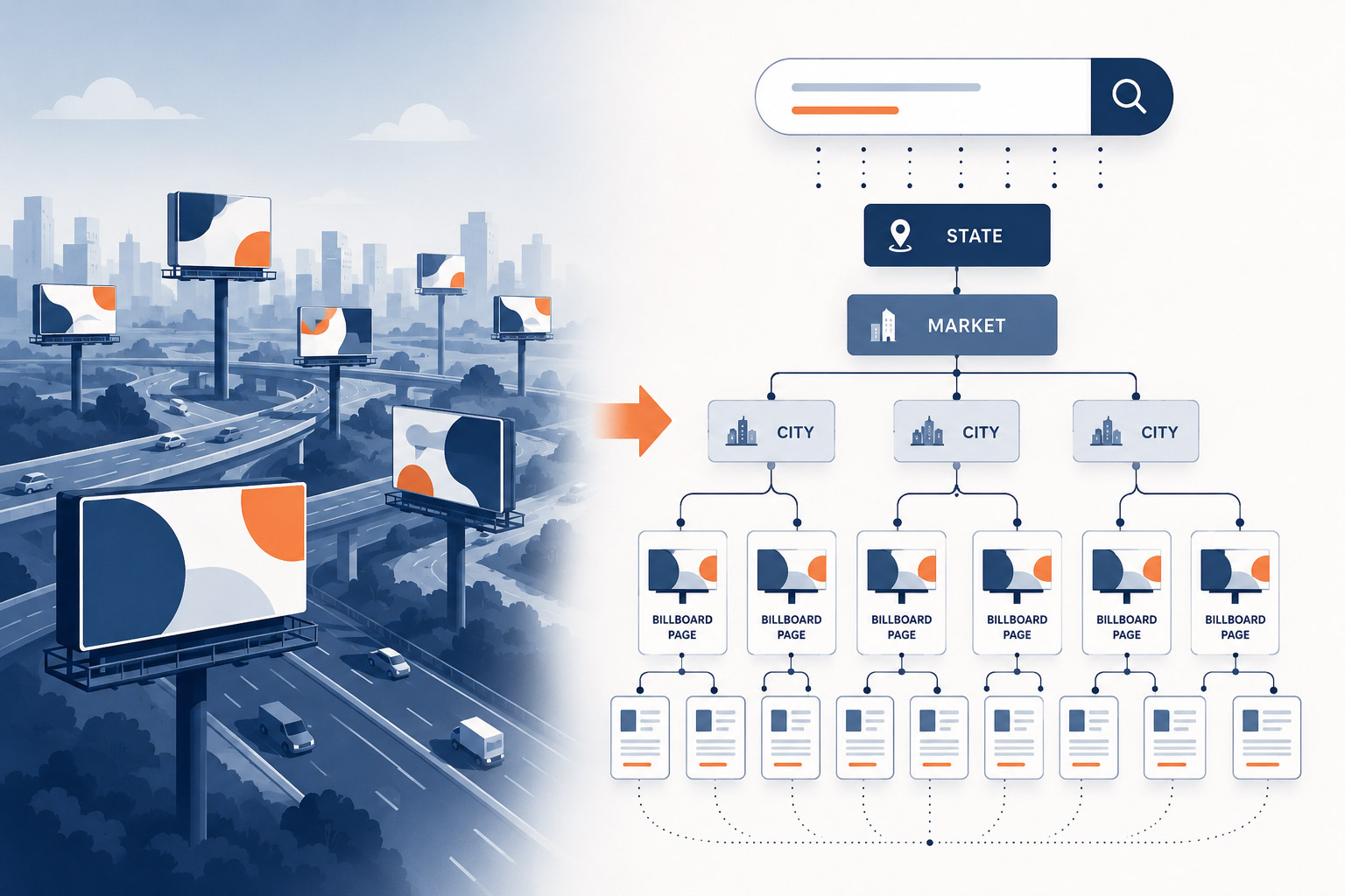
A useful website gives advertisers more than one path into the same inventory, and good navigation follows the buyer’s mental map. Someone might arrive from a state page, a market page, a city page, a highway page, a map, or a related billboard. Those aren’t redundant paths. They reflect the different ways real advertisers think about a campaign.
The internal system may still use unit numbers and operational categories. It should. The website has a different job.
The website has to translate that internal knowledge into public paths that make sense to people who are still deciding what they need.
A map helps, but it should not carry the whole billboard website navigation experience
Maps answer one question extremely well:
Where is it?
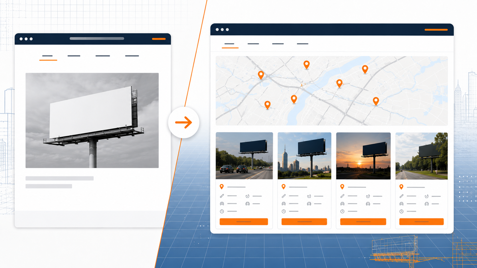
That is valuable for billboard website navigation. Maps help advertisers understand proximity, coverage, and location faster than text alone. For some buyers, a map is the most natural starting point.
But a map is not the same as navigation.
A map can show where inventory is located, but it does not always explain how the inventory is organized. It may not help someone compare cities, understand a market, browse a highway corridor, or return later to the same group of locations. On a phone, a map can also become difficult if there are too many pins, too many filters, or not enough supporting information.
The better approach is to let maps support the structure, not replace it.
A city page can include a map of billboards in that city. A highway page can show locations along that route. A market page can give someone a broader view before they narrow down to individual boards. The map becomes more useful because it sits inside a clear path.
Advertisers should be able to browse geographically, then use the map to confirm what they are seeing.
That is a very different experience from dropping someone onto a large map and asking them to figure everything out themselves.
Inventory pages need context around them
The previous article made a simple distinction: Google does not rank inventory. Google ranks pages.
The same idea applies to people.
A billboard page is easier to understand when it belongs to a larger structure.
A board in a small town means more when the visitor can also see the market it belongs to, the highway it faces, nearby cities, related locations, and other inventory in the area. Without that context, the page can feel isolated.
The advertiser may like the photo. They may understand the size and direction. But they still need to know how that board fits into the campaign they are considering.
This is why billboard website navigation should not be treated as a menu decision made at the end of a website project. It is part of the way inventory is explained. The menu, the market pages, the city pages, the map, the filters, the related-location links, and the inquiry paths all work together to help someone move from interest to understanding.
A billboard website should not make advertisers assemble the inventory picture from scattered pieces.
It should give them a reasonable path.
The salesperson benefits from better navigation, too
Navigation is often discussed as a user-experience issue, but for billboard operators it also affects the sales team.
A salesperson should be able to send a prospect to a useful place on the website.
Not just the homepage. Not just a search form.
Somewhere that picks up exactly where the conversation left off.
If the prospect asks about boards in a city, the salesperson should have a city page to send. If the conversation is about highway coverage, there should be a path into that highway inventory. If the buyer is comparing several locations, the website should make it easy to move between related boards without starting over.
This matters after the first conversation, especially when the advertiser shares options with someone else. The business owner, marketing director, agency planner, or franchise partner may not have been on the call. They need the website to recreate enough context for the locations to make sense.
Clear billboard website navigation helps support that handoff.
Instead of forcing the salesperson to explain everything manually, the website carries part of the explanation. It gives the buyer a structured way to review the opportunity, return to specific locations, and ask a more informed question.
That is why navigation is part of the sales process.
It shapes how inventory is discovered, how it is understood, and how the conversation continues.
The website should reduce the distance between interest and inventory
Most advertisers do not need a website to show them every internal detail at once. They need a path that helps them get oriented.
A better website shortens the distance between interest and inventory.
It doesn’t replace the salesperson.
It helps the salesperson start the next conversation with someone who already understands the basics.
That is the practical value of good navigation. It is not just cleaner menus or better page labels. It is a more useful sales experience.
Good navigation isn’t about menus.
It’s about helping advertisers find the inventory they’re looking for before they have to ask.
Navigation is part of the sales process.
Next in the Series
Good navigation helps advertisers find the right area, market, highway, or group of locations. But eventually the visitor needs to evaluate a specific board.
That leads to the next question: where should each billboard live on the website?
In the next article, we’ll look at why every billboard deserves its own page, and why a permanent page can keep working even as availability, advertisers, and campaigns change.